A Second Bite at the Apple
Sometimes you notice a location, and imagine what it could look like if you shot a photo there. Sometimes, it doesn’t turn out how you hoped.
I had been keeping an eye out for some moody fluorescent industrial lighting to use for a photo backdrop. A building that I frequently drive past had this grungy, fluorescent-lit loading dock, which seemed perfect.
Why fluorescent?
I couldn’t tell you the science, but I’ve found that as most exterior lighting has shifted towards more modern LED, the light cast by the LEDs just looks… unpleasant. In photos, anyway.
My theory, which I’ve honed while driving during many evenings and being repeatedly blinded by LED car headlights, is that it’s not just the peak brightness of LEDs that makes them so ugly to our eyes, but it’s the brightness coming from a dramatically smaller light source – often a small point of light – that makes it harsh and painful to look at.
Fluorescent tube lighting is softer, from a bigger source, and often with an interesting color cast that makes the light more satisfying to photograph and to edit. It glows, rather than… pierces.
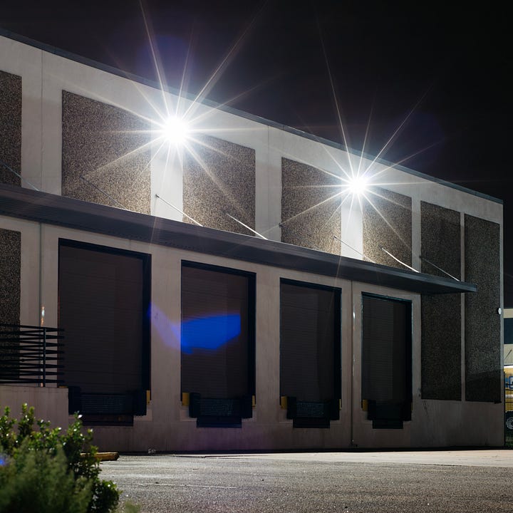
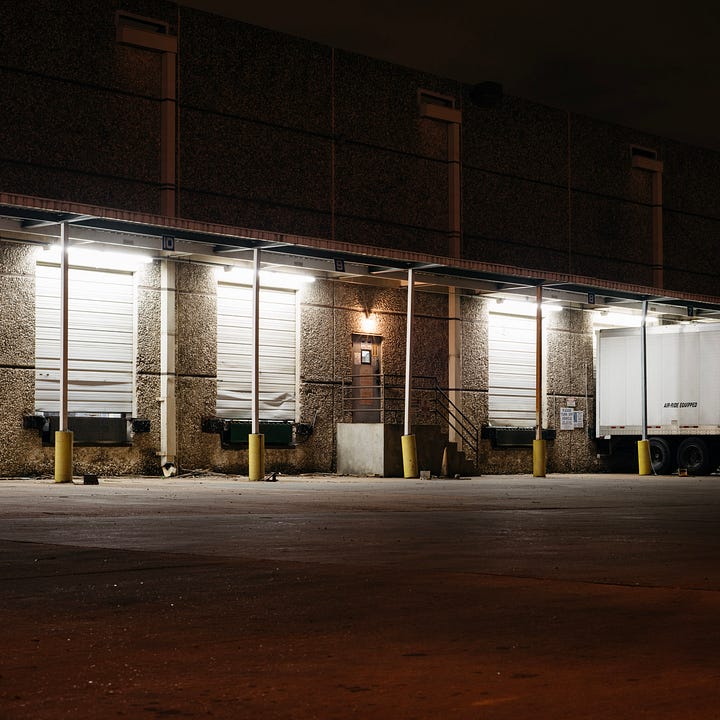
Attempt 1
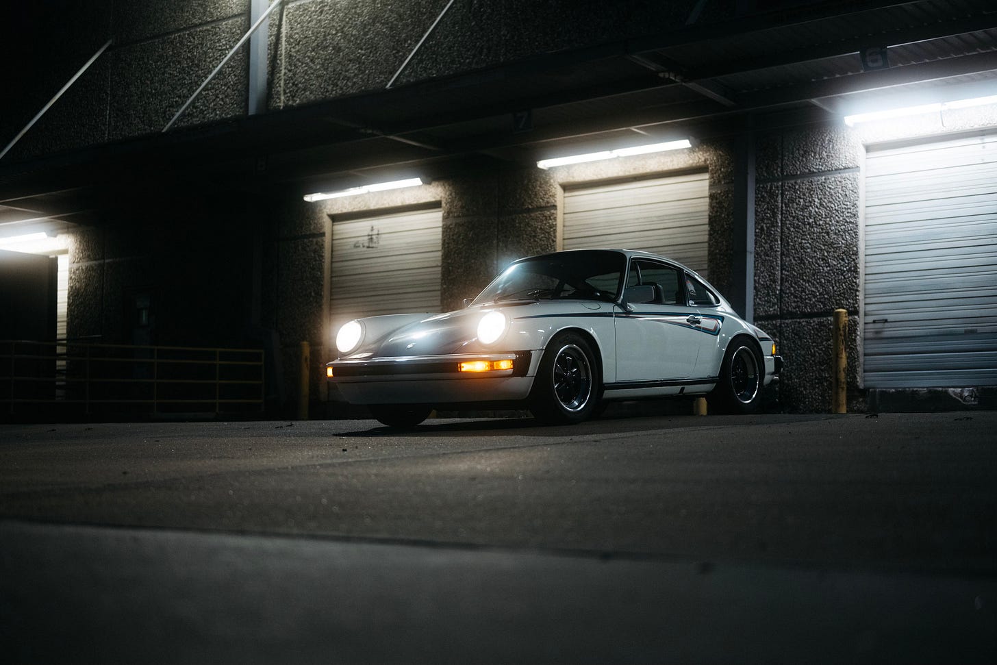
After shooting all the example photos and B-roll clips for my tutorial video about Flash technique, it had gotten dark, so I stopped by the location I had been wanting to try on my way home.
I parked the car, put a Pro-Mist filter on the lens to enhance the bloom effect of the lights, and started trying a few angles.
It looked.. wrong. I thought maybe in the edit, if I tweaked the color cast, it would improve things. It didn’t.
Some reasons why it didn’t look right to me:
The fluorescents are overpowered by — you guessed it — a giant LED mounted up high on the wall.
That LED illuminates the ground everywhere, so there’s very little light drop-off in foreground.
The wall texture is busy and ugly.
The yellow poles are distracting, and intersect with the car awkwardly. They could be removed in Photoshop, but that still wouldn’t transform this image.
I didn’t think that the car being parked on an angled ramp would bother me… but it did.
I never did anything with the images, because they didn’t seem good enough — something was missing.
Attempt 2
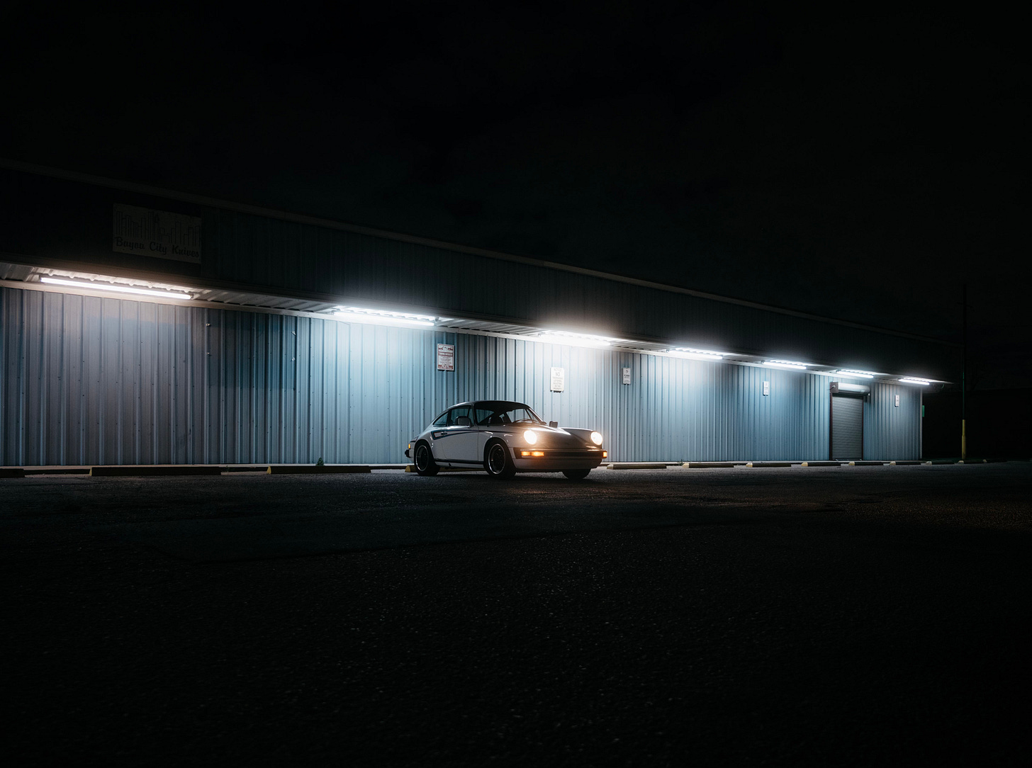
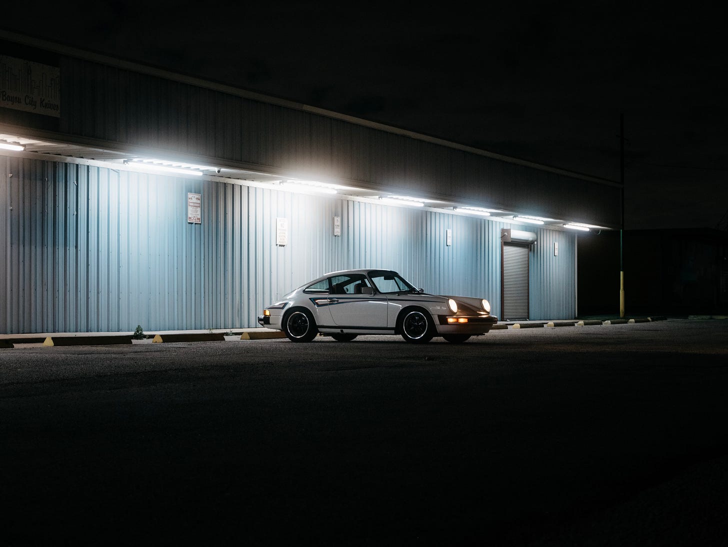
Fast forward a month or two, and I was driving back from a shoot, when I noticed a different building. Similarly, it featured a row of fluorescent lights, but it had zero other distracting light sources. There were fewer visual distractions in general. It was a half-mile from the other location — how had I never noticed this spot before?
I already had my camera bag, but I had to go back to get the car, and immediately, from the first click of the shutter, I could tell it was going to work for what I wanted.
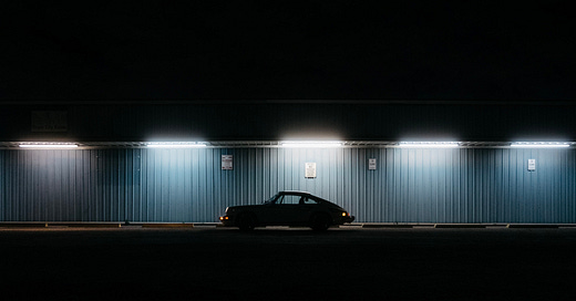
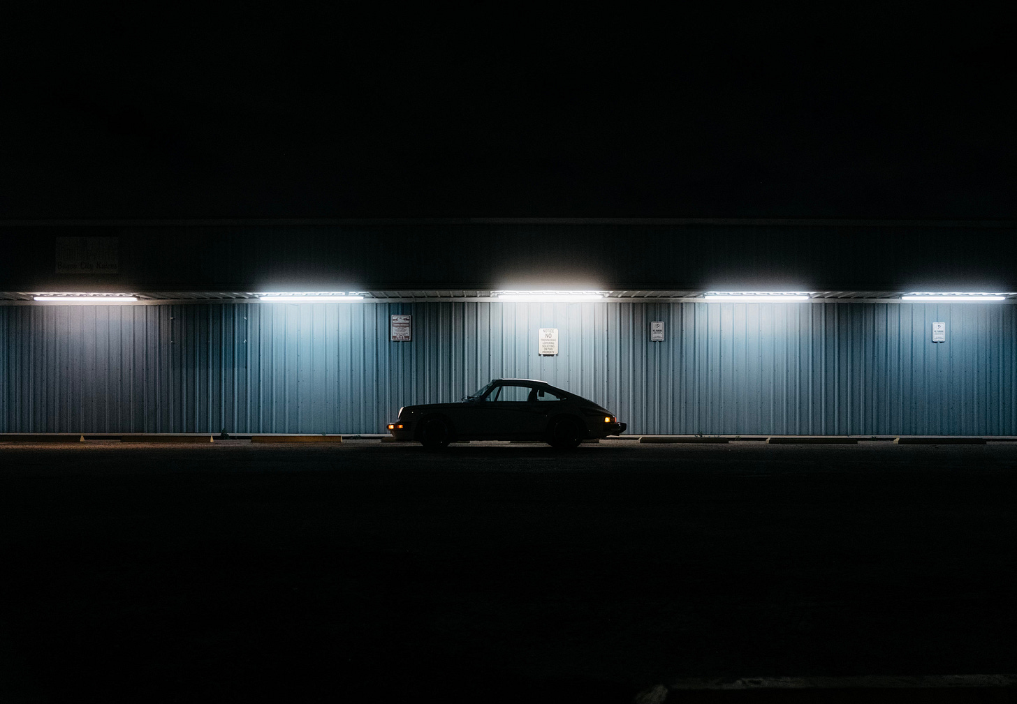
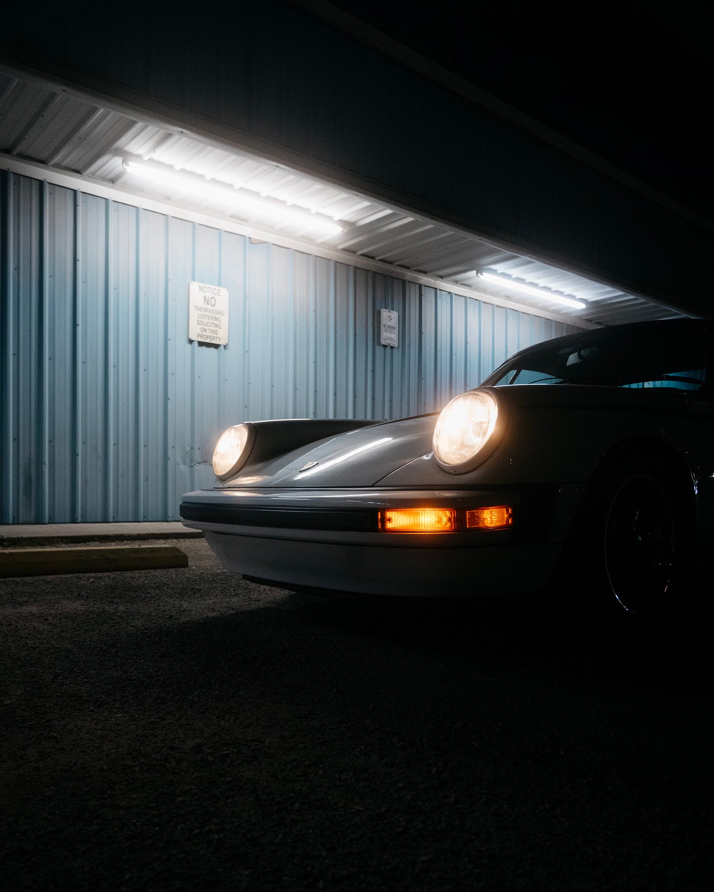
The wall texture is so simple, and the color so rich. I love how expansive the wall is. The light drops off in the foreground, background – everywhere that isn’t directly under the fluorescent bulbs. It gives it a mysterious, ‘edge of town’ feel that I was hoping for.
They aren’t perfect images, but these capture the mood I was after, in a way that the first location definitely did not. Perhaps analyzing the reasons why one scene worked and the other scene didn’t work will make it easier to spot the next location — or eliminate a deficient one — before I ever take the camera out of the bag.
I’m glad I kept looking. Hopefully this old hardware store building sticks around for a few more years before being torn down and replaced with a five-story apartment building, which will (of course) be illuminated by LED lights.
A note about the 24-70mm lens: You may have noticed that for the majority of these I used the 24-70mm lens, which I famously(?) criticized in 2022. Well, for a lot of the shoots I do, it’s not the most inspiring lens, but it’s a necessary evil. It wouldn't have been my first choice, but it was what I had with me, as both of these impromptu sessions happened while I was on the way home after shooting something else.





Great story! I really like the second location and think it would also lend itself well to a film shoot with Cinestill 800t; the halation effect could really interesting with that lighting. Thanks for sharing your process/thinking!